Looking for a way to make your next promotion look fresh, vital and undeniably modern? Pantone’s 2017 Color of the Year may be your best bet.
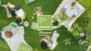
This year, Pantone selected Greenery – PMS 15-0343 – as the shade that best sums up the national mood. The selection of a brilliant, natural tone that doesn’t merely pair well with a wide variety of palettes, but it taps into the national zeitgeist.
“Greenery bursts forth in 2017 to provide us with the reassurance we year for amid a tumultuous social and political environment,” Leatrice Eiseman, executive director of the Pantone Color Institute said in a statement. “Satisfying our growing desire to rejuvenate and revitalize, Greenery symbolizes the reconnection we seek with nature.”
And we just think it looks great.
Ready to add some greenery to your window decal, banner or sign? You have a lot of options at your fingertips. Here are but a few ways to weave it into your designs. As always, Action Signs’ team of in-house designers is ready to bring your vision to stunning life.
Breathtaking Backgrounds: Greenery’s flexibility to slot into many existing color schemes makes it a natural choice for background coloration. Use it as a vibrant tone on its own, or as a gradient to for a natural combination of it with your brand colors.
Eye-Grabbing Accents: Ready to highlight an offer or a call to action on your sign? Break away from the typical reds and yellows and embrace the power of Greenery to pull customers’ eyes to the meat of your promotion.
A Break from Brand Colors: You’ve been disciplined about sticking to your brand colors, keeping even the slightest hint of palette creep at bay. Good work. Now surprise your customers with a fresh, yellow-green curveball. It’s not a direction you’ll want to abuse, but a touch of Greenery can give your organization a boost.
Ready to make a splash with Greenery (or any one of a million other colors)? Call Action Signs at 970.2124 to get rolling.