
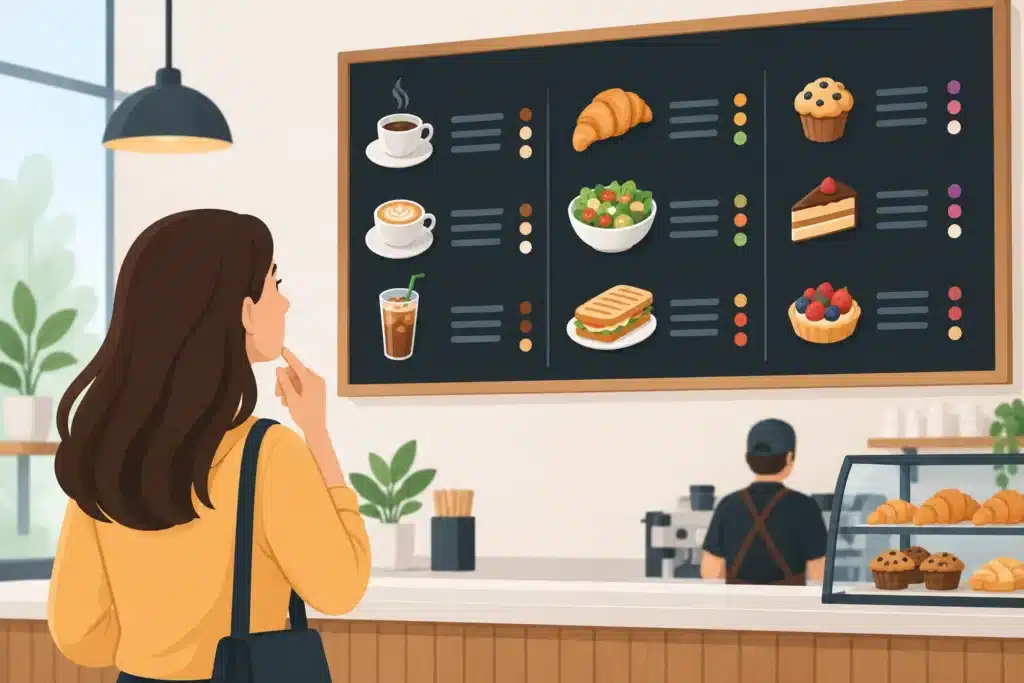
A customer standing at the counter should not have to search for prices, squint at small type, or ask what comes with a meal. Effective menu board signage answers those questions quickly, keeps the line moving, and gives your brand a more professional presence at the exact moment a purchase decision is being made.
For restaurants, coffee shops, breweries, concession areas, school cafeterias, healthcare food service, and retail counters, a menu board is more than decoration. It is an operating tool. When it is planned well, it reduces ordering friction, makes high-value items easier to notice, and gives staff a clearer, more consistent way to present what is available.
Why menu board signage affects the customer experience
A menu board has a short window to work. Customers may be reading it from several feet away, waiting in a line, dealing with noise, or trying to make a choice while a group waits behind them. That means a board can be attractive and still fail if its layout is crowded or its message is hard to scan.
Clear menu presentation helps customers decide with confidence. Categories should be recognizable at a glance, item names should be easy to read, and prices should sit where customers expect to find them. If modifiers, allergens, or ordering instructions are necessary, they need their own visual structure rather than being squeezed into the main menu copy.
There is also a direct brand consideration. A faded printed board, mismatched add-on panels, or handwritten price changes can make an otherwise well-run business look disorganized. Consistent colors, typography, imagery, and materials reinforce the same standards customers see in your storefront, interior signs, packaging, and staff presentation.
Start with the ordering path, not the artwork
The most common menu board mistake happens before design begins: trying to fit every available detail onto one display. A stronger approach begins with the customer journey. Where does a customer first see the menu? How far away are they? Do they order at a counter, in a drive-thru, from a waiting area, or at multiple stations?
A counter-service coffee shop may need a board that can be understood while customers move through a line. A fast-casual restaurant may need separate panels for entrées, sides, beverages, and pickup instructions. A drive-thru requires larger copy, higher contrast, weather-ready materials, and a layout that works from a vehicle. The right solution depends on the setting, the amount of content, and how often the menu changes.
Build a clear visual hierarchy
Customers should see the most useful information in a natural order: category, item, price, then any relevant description or option. Make category headers distinct without letting them compete with the menu itself. Use enough contrast between text and background, and avoid relying on color alone to communicate a choice or dietary distinction.
Featured items deserve attention, but not every item can be featured. Reserve larger images, callouts, or color blocks for promotions, best sellers, and products with higher margins. When every section is visually loud, customers cannot tell what matters most.
Legibility is also a production issue, not just a design issue. Type size, viewing distance, lighting, panel finish, and installation height all affect whether a board works in the real environment. A layout that looks clean on a computer screen can become difficult to read once it is installed above a counter or behind reflective glass.
Choose a menu board format that fits your operation
Static printed menu boards are a practical fit for businesses with stable offerings and a defined brand system. They can be produced as wall graphics, rigid panels, framed inserts, dimensional displays, or backlit cabinet graphics. They offer dependable color control and can be highly customized to match the surrounding interior.
For menus that change by season or daypart, replaceable graphic inserts can lower the cost and effort of updates. This format works well when staff need to swap out a lunch special, event pricing, or a limited-time promotion without replacing an entire sign system. The trade-off is that updates still need to be managed carefully so panels stay aligned, current, and clean.
Digital menu boards are useful for businesses that need frequent changes, scheduled messaging, rotating promotions, or daypart-specific content. They can reduce the need to print new menus for every update, but they also require reliable hardware, power, network planning, content management, and ongoing attention. A digital screen with stale content or poor brightness is not an improvement over a well-built printed board.
Many locations benefit from a hybrid approach. A permanent primary menu can handle core offerings, while a smaller digital display or changeable panel promotes specials, events, and seasonal items. This protects consistency while giving the operation room to respond to inventory, pricing, and marketing needs.
Specify materials for the environment
Interior menu boards face different demands than exterior or drive-thru displays. Behind a counter, glare from overhead lighting and sunlight from front windows can make glossy surfaces difficult to read. In kitchens or service areas, heat, humidity, grease, and frequent cleaning may influence material and finish choices.
For outdoor menu systems in Northern Colorado and Southern Wyoming, weather exposure deserves early attention. Temperature swings, UV exposure, wind, moisture, and snow can affect graphics, fasteners, cabinets, and illumination. Outdoor boards should be designed as a complete system, including structure, electrical needs where applicable, access for service, and durable finishes that support long-term readability.
Illumination can be worth the investment for locations with evening traffic, darker interiors, or drive-thru service. Backlit panels and internally illuminated cabinets improve visibility, but lighting should be even and appropriate for the content. Bright hotspots, weak illumination, or poorly placed fixtures can distract from the menu rather than support it.
Plan for updates before the board is built
Prices change. Products sell out. Promotions shift. A menu board should be designed with those realities in mind. If a business expects to update a section every month, that area should be easy to replace without rebuilding the full display. If the menu is unlikely to change for years, a more permanent fabricated solution may provide a cleaner finish and better value over time.
It also helps to establish approval ownership before production. Marketing may manage brand standards, operations may control prices and item availability, and facilities may be responsible for final placement and maintenance. A clear review process prevents costly revisions after fabrication and helps ensure that menus remain accurate after installation.
For multi-location businesses, consistency matters even more. Standardized layouts, approved colors, repeatable materials, and documented installation details make it easier to roll out new locations without each menu becoming a separate design exercise.
Get the installation details right
Menu board placement affects usability as much as the design does. Boards should sit within a customer’s natural sightline without blocking service equipment, access panels, sprinklers, or required clearance areas. At a counter, staff should be able to reference the board easily when answering questions. At a drive-thru, the structure must be positioned for safe traffic flow and practical viewing angles.
Installation may also involve wall conditions, electrical coordination, landlord requirements, permitting, or site-specific regulations. Those details are easier to manage when design, fabrication, and installation are coordinated by one accountable signage partner. Action Signs can help businesses carry a menu board project from site review and design through in-house production, installation, and future service.
A menu board should make the next choice feel obvious. When the information is easy to read, the materials fit the environment, and updates are planned from the start, the sign keeps working long after opening day.


