
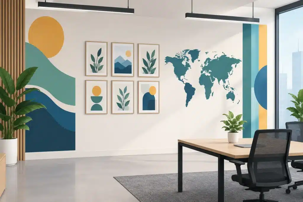
A blank office wall is rarely neutral. In a lobby, it can make a business feel unfinished before a visitor reaches reception. In a hallway, it can leave people guessing where to go. The right office wall graphics ideas turn those overlooked surfaces into useful brand assets – supporting recognition, wayfinding, culture, and day-to-day operations without taking up floor space.
The strongest projects do not start with a decorative pattern or a favorite quote. They start with the wall’s job. A reception wall needs to establish confidence. A clinic corridor needs to reduce confusion. A break room may be the right place to reinforce company culture or recognize employees. Once the purpose is clear, the design, material, scale, and installation approach become much easier to determine.
Office Wall Graphics Ideas for Real Business Needs
1. A dimensional reception logo
A reception logo is often the most visible interior brand element in an office. Dimensional letters, logos, and mounted panels create depth that flat graphics cannot always provide. They work especially well for professional offices, healthcare practices, corporate headquarters, and showrooms where first impressions carry real weight.
Material selection matters. Acrylic, brushed metal, painted PVC, wood, and illuminated elements all create different impressions. A crisp, high-contrast logo may be enough for a compact lobby, while a larger feature wall may call for layered materials and lighting. The goal is not simply to make the logo bigger. It is to make it readable, proportionate, and consistent with the rest of the environment.
2. Branded feature walls
A feature wall can carry a brand’s colors, textures, patterns, or visual language across a large interior surface. This approach is useful when an office needs energy but does not need a wall full of information. It is often a smart fit for waiting areas, conference rooms, open workspaces, and recruitment-focused environments.
The most effective feature walls use brand elements with restraint. An oversized pattern in muted tones can feel more established than a wall crowded with repeated logos. For businesses with a strong local identity, a custom illustration, regional landscape treatment, or abstract reference to the work they do can add character without looking like generic office decor.
3. Mission, values, and culture graphics
Values graphics belong where employees will actually see and use them. An entry corridor, training room, all-hands meeting space, or staff break area can make a better home than a customer-facing lobby. When words are placed in the right context, they can reinforce expectations and recognize the kind of workplace a company is building.
Keep the copy short. One clear statement, a set of well-chosen values, or a concise mission line will usually have more impact than paragraphs of text. Pairing the message with original photography, employee images, or graphic icons gives the wall a more credible and specific feel.
4. Wayfinding wall graphics
Wayfinding graphics help visitors move through a building with less interruption and less frustration. In offices with multiple departments, patient rooms, classrooms, tenant suites, or meeting spaces, wall-mounted directional graphics can clarify the route before someone has to ask for help.
Good wayfinding is direct: destination names, arrows, suite identifiers, and consistent color cues. It should also work with the building’s existing sign system rather than compete with it. For facilities managers, this is where wall graphics become more than branding. They are part of how the building functions.
5. Department and zone identification
Large workplaces can use graphics to make departments, work zones, and collaboration areas easier to identify. Color blocks, wall bands, icons, and large-format department names help employees and guests orient themselves quickly. This is especially helpful in manufacturing offices, education facilities, shared workspaces, and multi-tenant operations.
The trade-off is flexibility. If departments move often, permanent painted graphics may create more work later. Removable wall vinyl or modular panels can make more sense for spaces that change frequently.
6. Timeline and company history walls
A company history wall gives visitors a concise look at how the organization grew, what it has built, and the milestones that matter. It is a strong option for family-owned businesses, manufacturers, institutions, contractors, and organizations with deep roots in Northern Colorado or Southern Wyoming.
A timeline should be visual first. Use a limited number of meaningful dates, project images, historic photos, or recognizable achievements. Too much text turns a history wall into a reading assignment. The best versions give people a reason to pause without requiring ten minutes to understand the story.
7. Products, capabilities, or service graphics
For businesses that host customers, partners, candidates, or vendors, interior walls can explain what the company does before a meeting begins. A manufacturer can show its process. A contractor can feature completed work. A healthcare provider can explain treatment areas. A professional services firm can introduce specialties in a clear, visual format.
This is particularly valuable when the work is complex or difficult to explain quickly. Product and capability graphics should be designed for viewing at a distance, then reward a closer look with supporting details. High-resolution photography, diagrams, and concise labels work better than dense sales copy.
8. Conference room identity graphics
Conference rooms are useful places to extend a brand while improving internal navigation. A themed name, room number, or large visual treatment makes scheduling and finding rooms easier. It can also give virtual meeting participants a more polished backdrop.
The design should reflect how the room is used. A client-facing boardroom may benefit from subtle branded glass film or a refined wall logo. A creative team room may support bolder color, writable graphics, or an illustrated wall. Consider camera sightlines too. A graphic that looks excellent in person can become distracting on video if it sits directly behind the speaker.
9. Privacy film with branded detail
Glass offices and conference rooms create an open look, but they can also create privacy concerns and accidental collisions. Frosted vinyl, printed privacy bands, and decorative films address both needs while carrying a brand pattern or subtle graphic element.
This option is practical for healthcare offices, financial services, schools, and any workplace where confidential conversations occur. Coverage level should match the purpose. Full frosting offers greater privacy, while a lower band or partial pattern preserves visibility and daylight.
10. Wall murals that show the work
A mural featuring a business’s people, projects, equipment, or regional work can make a space feel authentic. Original images are generally more effective than stock photography because they show customers and employees what is actually behind the brand.
For large-format wall murals, image quality is nonnegotiable. A photo that looks acceptable on a screen may become soft or pixelated at full wall size. The wall itself also needs evaluation. Heavy texture, patched drywall, moisture, and direct sun can affect material choice and long-term appearance.
11. Writable wall graphics
Dry-erase wall films turn a portion of the office into a planning surface without installing multiple traditional whiteboards. They work well in project rooms, sales areas, classrooms, operations spaces, and agile team environments. Adding a printed grid, workflow stages, or branded headers makes the surface more useful from day one.
Placement matters. A writable wall should be accessible and well-lit, with enough clearance for people to stand and collaborate. It may not be the right answer for a public lobby, but it can be one of the hardest-working graphics in a team workspace.
12. Seasonal and campaign graphics
Not every wall graphic needs to stay up for years. Removable vinyl graphics can support a product launch, recruiting push, safety initiative, anniversary, event, or seasonal promotion. They allow a business to refresh a space without committing to a full remodel.
Temporary graphics still need professional planning. Colors should match established standards, messaging should be easy to update, and removal should not damage the paint or leave adhesive behind. A short-term application should look intentional while it is in place.
Plan the Wall Before Selecting the Graphic
Before approving artwork, assess the wall’s dimensions, viewing distance, lighting, surface condition, and surrounding fixtures. A design that looks balanced in a digital proof can feel undersized once installed on a 20-foot wall. Likewise, a dark graphic may lose impact in a dim hallway, while glossy material can create glare under direct lighting.
It also helps to think beyond a single wall. Reception logos, room signs, glass films, directional graphics, and feature murals should feel like parts of one system. That is especially important during a rebrand, office expansion, or multi-location rollout. Working with a partner that can design, produce, and install the full package reduces the risk of mismatched colors, incompatible materials, or last-minute installation issues.
Action Signs helps businesses plan interior graphics around the actual space, from initial design through in-house production and professional installation. The right choice depends on how the wall will be used, how long the graphic needs to last, and what visitors or employees need from it.
A well-planned wall graphic earns its place every day: it helps a visitor find the right room, gives an employee a clearer sense of belonging, or makes a customer understand the business before the conversation starts.


