
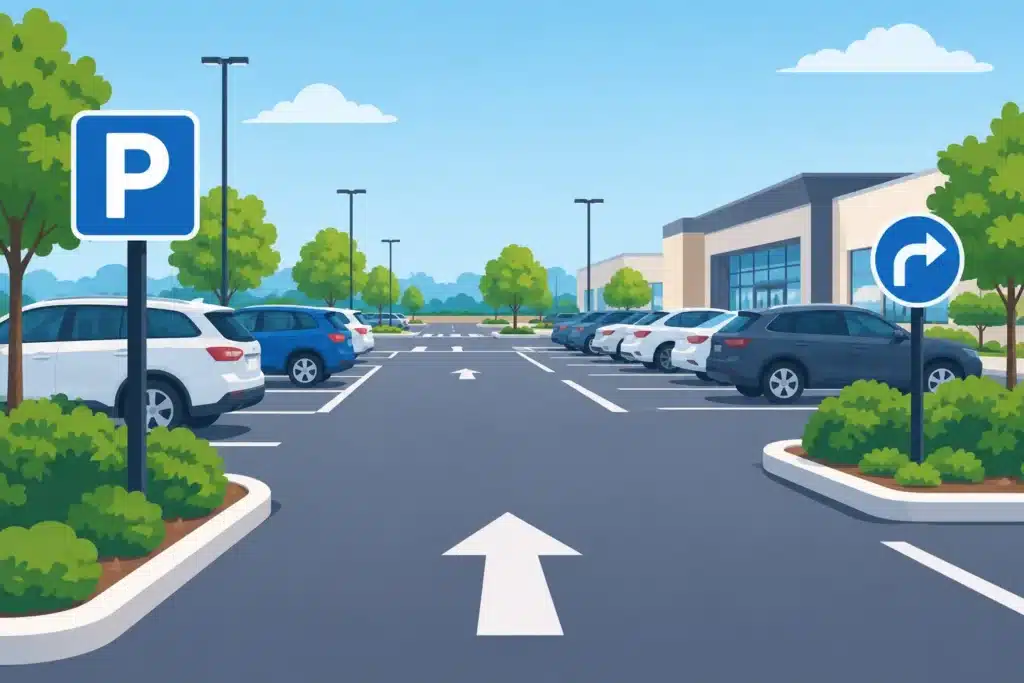
A customer should know where to enter, where to park, and how to reach your front door before they have to stop and guess. When a parking lot feels confusing, drivers make abrupt turns, miss accessible spaces, block fire lanes, and form the wrong first impression of the business they came to visit. Effective parking lot sign placement turns a paved area into an organized arrival experience – one that supports safety, access, and your operation.
For property owners, facilities managers, developers, and business operators, the right sign is only half the job. A well-made sign mounted where drivers cannot see it in time will not solve a traffic problem. Placement must account for vehicle approach speed, sightlines, pavement markings, lighting, local requirements, and the way people actually use the property.
Start With the Driver’s Decision Points
The best parking lots guide people one decision at a time. Start at the public street and trace the route a first-time visitor takes to the building. At each point where that driver must choose a direction, identify the information they need before reaching the choice.
This typically begins with entrance and exit signs. A clear directional sign positioned early enough for a driver to react prevents last-second lane changes and accidental entry into an exit drive. On larger properties, signs may then direct traffic toward visitor parking, pickup areas, loading zones, employee parking, building entries, or specific tenants.
The same approach applies to pedestrians. Once someone leaves their vehicle, they should be able to find the main entrance, a suite number, a crosswalk, or a designated pickup location without walking through active traffic lanes. Consider the full route, not just the sign location in isolation.
Give drivers enough reaction distance
A sign needs to be visible before a driver reaches the turn, not at the turn. The required distance depends on speed, traffic volume, weather conditions, and whether the lot has tight geometry or multiple competing signs. A shopping center entrance off a busy arterial requires earlier, larger guidance than a small professional office lot with low-speed traffic.
Avoid placing directional signs immediately behind landscaping, near a row of parked trucks, or where a driver must look away from cross traffic to read them. In Northern Colorado and Southern Wyoming, snow piles can also change sightlines during winter. A placement plan should account for seasonal conditions, not just a clear summer day.
Parking Lot Sign Placement at Key Areas
Not every lot needs the same sign package. A medical campus, industrial facility, retail center, school, and hotel all have different traffic patterns and user expectations. Still, several locations consistently deserve close attention.
At entrances and exits, use straightforward messages with high contrast. Drivers should immediately understand whether they are entering or leaving, whether a drive is one-way, and whether they need to stop, yield, or watch for pedestrians. If your site has separate customer, service, and delivery entries, distinguish them before vehicles reach the wrong drive.
At intersections within the lot, directional signs should confirm the route to key destinations. These signs work best when mounted at a consistent height and aligned with the direction of travel. Too many messages on one panel slow comprehension. If a property has several destinations, use a hierarchy: primary destinations first, secondary information later in the route.
Accessible parking signs require particular care. They must be positioned where they clearly identify the assigned space without interfering with vehicle doors, curb ramps, accessible routes, or pedestrian movement. Requirements can vary by jurisdiction and site condition, so the sign, post, mounting height, and location should be reviewed as part of the overall accessibility plan.
Fire lanes, loading areas, no-parking zones, and reserved spaces also need signs that remain visible when the lot is full. A curb stencil may support the message, but it can be covered by snow, faded by traffic, or blocked by vehicles. Post-mounted signs provide a more dependable reference point when enforcement or emergency access matters.
Design for Fast Reading, Not Close Inspection
Parking lot signs are viewed through windshields, often while drivers are watching for people, vehicles, and changing traffic conditions. The design needs to do its work quickly.
Use short messages, legible type, simple arrows, and strong contrast between copy and background. A sign that looks polished up close but requires drivers to slow down to read is not performing its intended function. Letter size, panel size, and mounting height should match the viewing distance and speed of the area.
Branding can be part of the system, especially at private campuses, hospitality properties, and multi-tenant developments. However, branding should not overpower regulatory or directional information. A consistent color palette, logo treatment, and sign structure can reinforce the property identity while keeping operational messages clear.
Consistency matters across the entire site. If visitor parking uses one color, arrow style, and type treatment at the entrance, repeat those cues at later decision points. Mixed styles make people re-read every sign instead of recognizing the system at a glance.
Balance Visibility With Real-World Site Conditions
A sign location that works on a site drawing may create problems in the field. Light poles, utility equipment, landscaping, drainages, curbs, overhead canopies, and existing signs all affect installation and visibility. Before fabrication, review the site from the driver’s perspective at the actual approach angle.
Nighttime conditions deserve the same attention. Parking lot lighting can create glare, shadows, and uneven visibility. Reflective sign materials may be appropriate for traffic-control messages, while illuminated or externally lit signs may be necessary for large properties with evening operations. The right choice depends on the purpose of the sign, available power, local regulations, and the level of nighttime traffic.
Material selection also affects placement decisions. Aluminum panels, durable posts, protective finishes, and hardware suited to local wind and weather help signs stay aligned and readable over time. In exposed areas, a lightweight panel or undersized support may save money at installation but create maintenance issues later.
Keep signs out of conflict zones
Posts should not create obstacles in walking paths, vehicle overhang areas, snow-removal routes, or door-swing zones. They should also be positioned to avoid underground utilities and irrigation where applicable. In a busy lot, even a small placement adjustment can make the difference between a sign that lasts and one that gets struck repeatedly.
Coordinate signs with striping, wheel stops, bollards, and curb paint. These elements should reinforce one another rather than send conflicting messages. For example, an accessible parking sign, pavement marking, access aisle, and curb ramp should read as one coordinated area.
Permitting and Code Review Should Happen Early
Parking lot signage can be subject to municipal sign codes, zoning conditions, accessibility requirements, fire department standards, and property-specific rules. A development may also have tenant criteria or architectural standards that govern colors, materials, or monument sign relationships.
Early review reduces costly changes after fabrication or installation. This is especially valuable when a project includes a new site, a remodel, a rebrand, or a change in traffic pattern. Temporary construction conditions may require their own directional and safety signage while permanent signs are being installed.
An experienced commercial sign partner can help translate a site plan into a practical sign program, then manage the details that follow: design, fabrication, permitting coordination, installation, and future service. Action Signs approaches parking lot projects with those field conditions in mind, so the finished signs support the way the property operates rather than simply filling a line item on a plan.
Review the Lot After Installation
The most useful test is simple: visit the property as if you have never been there. Drive in during busy hours. Enter from each access point. Park in a typical customer space. Walk to the entrance. Then return after dark if the business operates in the evening.
Look for hesitation points, blocked signs, confusing arrows, faded markings, and places where people routinely ignore the intended route. Feedback from reception staff, maintenance teams, delivery drivers, and customers can reveal recurring issues that are easy to miss from an office window.
Parking lots change over time. A new tenant, expanded patio, relocated dumpster, altered drive-thru lane, or construction project can make an existing sign plan outdated. Periodic review and prompt repairs keep the site clear, safe, and professional for everyone who arrives there.
The goal is not to cover the lot with signs. It is to place the right message where it prevents uncertainty, protects access, and helps every visitor reach the right destination with confidence.


