
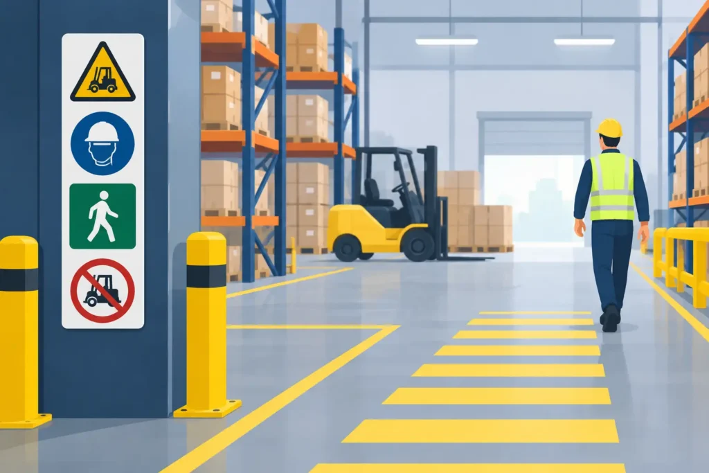
A forklift rounds a rack end, a pallet is staged outside its marked zone, and a visitor steps into an active loading area. In a warehouse, those are not abstract safety concerns. They are everyday conditions that warehouse safety signage must address quickly and clearly. The right signs help people make safer decisions before a supervisor has to intervene.
For facilities managers, operations leaders, contractors, and business owners, safety signs are more than a compliance purchase. They are part of the working environment. A sign system has to hold up to traffic, dust, changing layouts, temperature swings, and the pace of a busy shift. It also has to be visible to the person who needs it at the exact moment they need it.
What Warehouse Safety Signage Needs to Do
A warehouse can contain pedestrian routes, forklift lanes, loading docks, battery charging areas, chemical storage, overhead hazards, emergency equipment, restricted work zones, and high-stacking operations within a relatively compact footprint. A generic sign package rarely accounts for how those conditions overlap.
Effective signage gives workers and visitors a clear answer to one of three questions: Where can I go? What hazard is here? What action do I need to take? If a sign does not answer one of those questions quickly, it may add visual noise without improving safety.
The strongest programs use visual hierarchy. Immediate hazards need the most direct placement and clearest message. Directional signs should guide movement before someone reaches a conflict point. Identification signs, such as labels for first-aid stations or fire extinguishers, need to remain visible even when the area is crowded with inventory or equipment.
This approach also supports consistency. When forklift routes use one recognizable color system and pedestrian areas use another, employees do not need to stop and decode every sign from scratch. That matters during busy receiving periods, seasonal peaks, and shift changes, when attention is divided.
Start With the Actual Traffic Pattern
Before selecting materials, colors, or mounting methods, walk the facility during normal operations. A plan drawn from an office can miss the practical details that shape sign visibility: stacked pallets, open dock doors, rack uprights, temporary staging, glare from overhead lighting, and blind corners created by equipment.
Follow the path of a pedestrian entering from the parking lot. Then trace the route of a forklift from receiving through storage and shipping. Watch where those paths cross. Look for doors that open into travel lanes, corners where operators need a mirror or warning sign, and areas where people routinely take shortcuts.
A useful site review should identify several sign categories:
- Traffic control signs for forklift lanes, pedestrian crossings, stop points, speed limits, and right-of-way rules
- Hazard warnings for low clearance, pinch points, fall risks, battery charging, electrical panels, and chemical areas
- Required-action signs for personal protective equipment, authorized personnel, lockout procedures, and safe operating practices
- Emergency signs for exits, evacuation routes, first aid, eyewash stations, fire equipment, and assembly areas
- Area identification signs for docks, aisles, departments, inventory zones, and restricted spaces
The goal is not to cover every wall with a warning. Too many signs can make the most critical messages easier to miss. Instead, place signs where a person can act on the information. A forklift speed limit sign belongs before the operator enters a high-traffic corridor, not after it. A required-PPE sign should be posted at the entrance to the area where PPE becomes necessary.
Match Materials to the Warehouse Environment
Warehouse signs are exposed to more abuse than office signs. Cart traffic, cleaning, moisture, UV exposure near dock doors, and contact with pallets can quickly damage lightweight or poorly mounted graphics. Material selection should reflect the location and expected service life.
Rigid aluminum or composite panels are often a strong choice for permanent traffic, safety, and exterior-adjacent applications. They resist moisture and maintain a professional appearance over time. For indoor wall-mounted messages, durable printed panels or laminated graphics may be appropriate. Floor graphics can be effective for defining walkways, staging areas, and exclusion zones, but they need a surface and laminate designed for foot traffic and equipment movement.
Reflective materials can improve visibility in low-light areas or near loading docks. Photoluminescent signs may be appropriate for egress marking where emergency visibility is a concern. The best choice depends on the lighting, surface condition, cleaning practices, and the amount of direct vehicle traffic in the space.
Mounting deserves the same level of attention. A sign attached to rack uprights needs to stay put without creating a snag point. Floor decals need clean preparation and careful placement. Suspended signs must remain readable from the intended viewing distance without interfering with sprinklers, equipment, or aisle clearance. A sign that curls, fades, or is blocked within a few weeks is not a long-term safety solution.
Make the Message Readable at Working Speed
Workers do not read warehouse signs the way they read a policy manual. They scan them while walking, driving, lifting, or preparing to complete a task. Short wording, high contrast, and recognizable symbols are usually more effective than long instructions.
Use large type for messages that must be read from a distance, such as dock numbers, aisle identifiers, speed limits, and overhead clearance warnings. Keep the primary instruction prominent. If additional details are required, place them below the main message rather than competing with it.
Color can help establish meaning, but color alone should never carry the full message. A red sign may signal prohibition or fire equipment, while yellow often calls attention to a hazard. Blue can identify required actions, and green is commonly used for emergency or safe-condition information. Pair color with clear text and symbols so the message remains understandable in variable lighting and for people with color-vision differences.
Bilingual signage may also be necessary depending on the workforce. When used, both language versions should be easy to read and given appropriate space. Shrinking critical copy to fit too much information onto one small sign defeats the purpose.
Plan for Change, Not Just Opening Day
Warehouses change. A new racking layout, expanded pick area, added conveyor line, or revised shipping process can make existing signs inaccurate overnight. Safety signage should be part of the change-management conversation whenever traffic patterns or work areas are modified.
This is where a coordinated sign system pays off. When signs share sizes, colors, fonts, and mounting standards, updating a zone is more straightforward. Facilities teams can replace outdated messages without creating a patchwork of mismatched temporary notices.
It is also worth establishing a routine inspection schedule. Check whether signs are still visible, legible, secure, and relevant. Look for damage, blocked sightlines, faded graphics, and signs that employees have learned to ignore. Incident reports and near-miss observations can reveal where a message is missing or where the current placement is not working.
Temporary signage has a place during construction, maintenance, spills, seasonal storage changes, or short-term operational shifts. But temporary signs should not become permanent by neglect. If a hazard or routing change lasts beyond the immediate project, replace handwritten notices and taped paper with a durable, professionally produced solution.
Bring Safety and Facility Branding Together Carefully
A safety sign’s first job is clarity. Brand colors, logos, and visual standards can support a clean, organized facility, but they should never dilute a safety message or conflict with recognized warning colors. The balance is usually straightforward: keep the safety communication direct, then use consistent design standards in area identifiers, directional signs, dock markers, and facility wayfinding.
For multi-site operators, consistency is especially valuable. A worker or driver who moves between locations should encounter familiar traffic conventions and sign formats. Standardization reduces confusion while reinforcing a professional operation.
A full-service sign partner can help translate a facility assessment into a coordinated production and installation plan. Action Signs can produce durable safety panels, floor graphics, directional signs, and custom facility identifiers while accounting for how each piece will be installed and maintained in a working warehouse.
A Safer Warehouse Is Easier to Navigate
The best warehouse safety signage does not compete for attention. It creates an environment where routes are obvious, hazards are identified before they become incidents, and employees can move through the facility with fewer avoidable decisions. Start with the real conditions on the floor, choose materials built for the environment, and keep the system current as operations change. That practical work helps turn signage into a dependable part of daily safety performance.


