
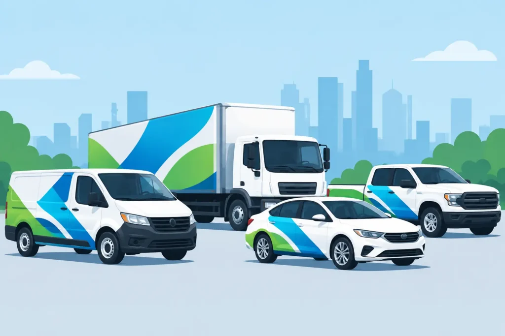
A fleet vehicle is often the largest sign your company owns – and the one seen by the most people in a normal workday. The best fleet graphics design ideas do more than make trucks, vans, and service vehicles look polished. They make your company recognizable at a glance, reinforce trust at job sites, and turn routine travel into consistent local advertising.
For businesses operating across Northern Colorado and Southern Wyoming, effective fleet graphics need to perform in real conditions. They must read clearly from a distance, hold up through changing weather, and stay consistent across vehicles that may vary in size, model, and purpose. A strong design starts with those practical realities rather than treating every vehicle like a blank billboard.
Start With a System, Not a Single Vehicle
The most successful fleet programs are built around a repeatable visual system. Your logo, primary colors, typefaces, service messaging, and placement rules should work on a pickup, cargo van, box truck, trailer, or SUV without losing their identity.
This does not mean every vehicle has to look identical. A compact service van may need a simplified version of the design, while a larger box truck can carry bolder graphics and more service detail. The goal is immediate recognition: someone who sees one of your vehicles should know it belongs to the same company when they see the next one.
Before production begins, confirm the vehicle list, model years, paint colors, and body styles. Designing from accurate vehicle templates prevents logos from landing on door seams, handles, fuel doors, sensors, or areas that make installation difficult. It also helps keep future additions to the fleet consistent.
10 Best Fleet Graphics Design Ideas for Business Fleets
1. Put the company name where people naturally look
The side doors are usually the highest-value real estate on a work vehicle. Place the company name and logo prominently there, using enough contrast and scale to be read from across a parking lot or adjacent lane. A small logo tucked into a corner may look understated in a mockup, but it loses its value when the vehicle is moving.
For larger vehicles, use the rear doors and side panels as separate viewing opportunities. Drivers behind a van often have several seconds to absorb a message, while side graphics may only be visible briefly at an intersection.
2. Use color contrast before decorative effects
A clean dark-on-light or light-on-dark design will usually outperform a detailed graphic with weak contrast. Your fleet should be recognizable in bright sun, rain, snow, and low evening light – not only in a controlled design presentation.
High contrast also supports legibility when vehicles are dusty or parked in visually busy locations. If your brand palette uses similar shades, a designer can introduce a neutral background panel, outline, or color block without changing the core brand identity.
3. Give each vehicle one clear message
A fleet graphic is not a brochure. Trying to list every service, certification, office location, and social account usually creates clutter that no one can read at speed. Lead with the company name, what you do, and one easy way to respond, such as a phone number or web address.
For example, an HVAC contractor may pair its logo with “Heating, Cooling & Plumbing.” A commercial contractor may be better served by “Building Northern Colorado Since 1988.” The right message depends on whether your priority is explaining an unfamiliar service, building local credibility, or supporting a well-known name.
4. Use a bold service category on specialty vehicles
When part of the fleet serves a specific division, label it clearly. A plumbing truck, restoration van, delivery vehicle, and sales SUV may all use the same visual foundation while calling out their individual role.
This approach helps customers identify the right crew when arriving at a home, facility, or job site. It can also improve internal organization for companies with multiple departments. Keep the division marker secondary to the master brand so the fleet still reads as one operation.
5. Make rear-door graphics earn their space
Rear graphics are especially valuable for service vans, box trucks, and trailers. Include a large logo, a short service line, and a readable call to action. This is often the best location for a phone number because following drivers have more time to see it.
Avoid placing critical information across door gaps, hinges, latches, or bumper areas. A well-planned rear layout accounts for these interruptions and remains readable even when one door is open.
6. Add a distinctive visual element people remember
A recognizable pattern, angled color field, illustrated icon, or brand-specific stripe can make your vehicles easier to spot without overcomplicating the layout. The strongest visual elements are simple enough to repeat across the fleet and distinctive enough to be remembered after a brief encounter.
This is where custom design matters. Generic swooshes and stock imagery can make a vehicle look decorated, but they rarely build a memorable brand. A visual feature should support your existing identity, not compete with it.
7. Design for distance, speed, and viewing angle
The viewing conditions for fleet graphics are different from a storefront sign. Someone may see your vehicle from 50 feet away while driving, from an upper-floor office window, or while passing a job site on foot. Large type, limited copy, and clear hierarchy are essential.
As a practical rule, the company name should be the first thing a viewer sees. The service category comes next, followed by contact information. If every element has equal weight, none of it has enough impact.
8. Use partial wraps when they fit the budget and vehicle
A full wrap creates the most complete transformation, but it is not always necessary. Partial wraps, printed panels, and cut vinyl lettering can produce a strong result at a lower cost when the vehicle’s base color supports the design.
For a growing fleet, a hybrid approach can be practical. Use full wraps on high-visibility sales or delivery vehicles, then apply coordinated door graphics and rear lettering to work trucks. The key is maintaining the same logo scale, colors, and layout principles so the fleet does not look pieced together.
9. Plan for durability and maintenance from the start
Fleet graphics face road grit, automatic car washes, snow, UV exposure, and frequent handling around doors and equipment compartments. Material selection and installation quality affect how the graphics perform over time.
Durable films, appropriate laminates, and careful surface preparation help graphics stay secure and professional-looking. Designs should also account for high-wear areas. A large graphic that wraps tightly around a rough step or frequently used handle may need adjustment to avoid premature damage.
10. Build in room for future fleet growth
A vehicle program should not have to be redesigned every time you buy another truck. Save approved artwork, color specifications, font details, vehicle layouts, and production notes so new units can be added efficiently.
This is particularly valuable for companies managing multiple locations, acquired fleets, or seasonal equipment. A documented graphics standard protects brand consistency even when vehicle types change over time.
Common Design Mistakes That Cost Visibility
The most common problem is simply making the logo too small. Business owners sometimes worry that a large logo will feel aggressive, but fleet graphics compete with traffic, buildings, weather, and distance. If the name cannot be read quickly, the vehicle is not doing its marketing job.
Another frequent issue is too much text. A long list of services may feel comprehensive, yet it leaves viewers with no clear takeaway. Use your fleet to create awareness and prompt a next step. Detailed information belongs in the sales conversation, proposal, or website.
Finally, do not treat vehicle graphics as an afterthought once a vehicle is already needed in the field. A coordinated design, production, and installation schedule reduces downtime and avoids rushed decisions. For larger fleets, installation can often be phased so crews remain operational.
From Design Approval to a Fleet That Works
A dependable fleet graphics partner should consider more than the artwork. The process should include accurate measurements or templates, material recommendations, production planning, installation logistics, and a path for replacing damaged graphics later. That level of coordination matters when a vehicle is a working asset, not just a marketing piece.
Action Signs helps regional businesses carry their brand from the first vehicle through an expanding fleet, with in-house design, production, and installation managed as one accountable process. The best result is a fleet that looks intentional on day one and remains easy to maintain as your business moves forward.
Your vehicles already travel through the communities you serve. Give them a design clear enough to be remembered, durable enough to keep working, and consistent enough to build confidence before your crew ever steps out of the cab.


