
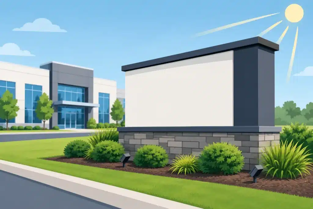
A driver approaching your property may have only a few seconds to find the entrance, recognize your business, and decide where to turn. That is why learning how to choose monument signs is more than a design exercise. The right sign improves visibility, reinforces your brand, helps visitors navigate the site, and holds up to years of Colorado and Wyoming weather.
A monument sign is a long-term property investment. It needs to work from the road, fit the architecture, meet local requirements, and remain easy to update and service. Starting with the practical decisions first will lead to a better-looking sign and fewer costly changes later.
Start With What the Sign Needs to Accomplish
Before choosing colors, finishes, or lighting, define the sign’s primary job. A medical office may need to direct patients to the right entrance. A multi-tenant retail center may need to identify several businesses without creating visual clutter. A manufacturer in an industrial park may need a durable sign that gives delivery drivers a clear destination.
Most monument signs support more than one function, but one purpose should lead the design. If traffic visibility is the priority, size, placement, contrast, and illumination matter most. If the sign will sit at the entrance to a professional campus, architectural fit and a refined material palette may carry more weight. For a property with frequently changing tenants or promotions, an electronic message center or replaceable tenant panels may be worth considering.
Think about who needs to read the sign and when. A sign viewed by drivers moving 40 miles per hour requires a different approach than one serving pedestrians in a parking lot. Daytime-only visibility has different requirements than a sign that must identify a business after dark.
How to Choose Monument Signs for Road Visibility
Visibility begins with the site, not the artwork. A logo that looks excellent on a computer screen can become hard to read when it is placed too low, surrounded by landscaping, or viewed from across several lanes of traffic.
Evaluate sightlines from both directions
Stand or drive where customers approach the property. Look for trees, utility poles, parked vehicles, neighboring signs, slopes, and turning lanes that may block the view. Check the property from both directions of travel. In many locations, one approach offers a clear line of sight while the other requires a different placement or a larger sign face.
The best location is not always directly at the property line. A sign placed too close to the road can be difficult to read because drivers pass it before processing the message. A sign set too far back may lose impact or become obstructed. Local setback rules also affect the available placement.
Keep the message simple at speed
For roadside monument signs, prioritize the business name, logo, and the most useful identifying information. Long taglines, multiple phone numbers, and dense service lists usually reduce readability. If people need more detail, provide it after they enter the site through window graphics, directional signs, or interior displays.
Letter height matters. Larger lettering can be read from farther away, but increasing the overall sign size is not always necessary if the layout is simplified. Strong contrast between letters and the background also improves readability. A dark logo on a dark background may match a brand guide but underperform from the street.
Match the Sign to the Building and Property
A monument sign should look like it belongs on the property. It does not need to duplicate the building exactly, but it should use compatible materials, colors, and proportions.
Stone or masonry bases can complement medical offices, hospitality properties, residential developments, and established commercial campuses. Aluminum cabinets, routed panels, dimensional letters, and painted finishes often suit modern retail, industrial, and professional buildings. Brick, stucco, wood-look finishes, and architectural panels can also be incorporated when they support the property design.
Material selection is partly aesthetic, but it is also practical. Natural stone provides a substantial appearance but can add cost and installation complexity. Painted aluminum is flexible, durable, and well suited to custom shapes and branded colors. High-density urethane can create dimensional architectural details while resisting moisture, but it should be specified and finished properly for outdoor use.
Northern Colorado and Southern Wyoming sites need materials that can handle sun exposure, wind, temperature swings, snow, and occasional hail. Ask how the sign face, paint, fasteners, lighting components, and base materials will perform over time. A lower initial price can become expensive if finishes fade early or replacement parts are difficult to access.
Choose Lighting Based on Operating Hours
Illumination is one of the biggest decisions in a monument sign project. If customers, patients, guests, or deliveries arrive after dark, the sign should remain readable without relying on nearby parking lot lights.
Internally illuminated cabinets provide consistent visibility and work well for logos, tenant panels, and changeable copy. Halo-lit dimensional letters create a more architectural appearance, although they may not provide the same viewing distance as a fully illuminated face. External lighting can be effective for masonry or dimensional signs, but fixtures must be aimed carefully to avoid glare and uneven coverage.
Electronic message centers can add flexibility for schools, churches, financial institutions, municipalities, retail centers, and businesses with time-sensitive messaging. They also introduce additional considerations: local ordinances may regulate brightness, animation, message changes, and operating hours. Make sure the display is large enough to be useful, not simply added as an afterthought.
Plan for Brand Hierarchy and Future Changes
A monument sign is often the first physical expression of your brand that a customer sees. The business name should be easy to identify, with logos, colors, and typography reproduced accurately. This is especially important for franchise operators, multi-location businesses, and properties with established brand standards.
At the same time, brand consistency should not override legibility. A small registered trademark symbol, subtle tonal color shift, or thin script font may be appropriate in print but disappear at roadside viewing distances. An experienced sign team can preserve the brand while adapting it for real-world visibility.
Consider what might change in the next several years. A multi-tenant property may need modular panels that can be replaced without rebuilding the sign. A business planning an expansion may want space reserved for an additional division or tenant. If seasonal promotions are common, a message display or designated changeable-letter area may be more useful than permanent copy.
Account for Permits, Utilities, and Installation Early
Many monument sign projects become delayed because critical site details were not addressed during design. Municipal sign codes may limit height, overall sign area, lighting type, electronic display features, setbacks, or the number of signs allowed on a property. Planned development standards and landlord requirements can add another layer of review.
Installation also depends on conditions below and around the sign. The foundation must be designed for the sign’s size, wind exposure, soil conditions, and local requirements. Illuminated signs need an electrical plan. Existing irrigation, underground utilities, drainage, sidewalks, and landscape features may affect where the sign can be installed.
This is where working with one accountable sign partner matters. Design, fabrication, permitting coordination, installation, and future service all affect each other. Addressing those details early helps avoid redesigns after materials have been ordered or a foundation location has been selected.
Set a Budget for the Full Life of the Sign
A useful budget includes more than the visible sign structure. Factor in design, engineering when required, permitting, electrical work, foundation construction, installation, landscaping restoration, and future maintenance.
The lowest bid may omit work that has to be completed later by another contractor. It may also use materials or construction methods that make service more difficult. Compare proposals by scope, materials, illumination, warranty coverage, installation approach, and what is included for permits and site preparation.
For a sign expected to represent your business for a decade or longer, serviceability has real value. LED components, access panels, replaceable faces, and durable finishes can reduce disruption when maintenance is needed. A dependable local provider such as Action Signs can also support repairs, updates, and related property signage as your needs change.
The most effective monument sign is the one that makes your property easier to find and your business easier to remember. Bring site photos, property plans, brand standards, and a clear picture of your audience to the planning process. Those details give your sign team the information needed to build a solution that looks right on day one and continues working long after installation.


