
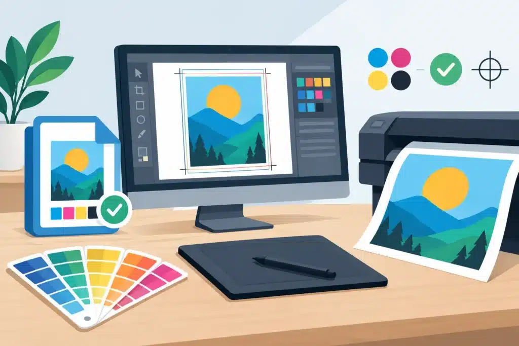
A signage project can look finished on screen and still be far from production-ready. Print ready signage files need to account for more than artwork: final dimensions, viewing distance, material choice, fabrication methods, and site conditions all affect what can be produced and installed successfully. Preparing files correctly early helps avoid rework, protects your brand standards, and keeps a storefront opening, rebrand, construction deadline, or fleet launch moving.
For commercial signs, the goal is not simply to provide a high-resolution PDF. The goal is to provide artwork that accurately communicates what needs to be built. That distinction matters when a design moves from a monitor to a routed panel, dimensional letters, window graphics, a vehicle wrap, or a building-mounted sign.
Start With the Final Sign, Not the Design File
Before exporting anything, confirm what the sign is supposed to be. A banner, wall graphic, post-and-panel sign, vinyl decal, channel letter set, and aluminum cabinet all have different production requirements. A file prepared for a printed window graphic may need bleed and panel overlap. A file for routed acrylic letters needs clean vector paths and clearly defined mounting details.
Final size is the first question. Build artwork at full scale whenever the software can handle it. For very large signs, such as building graphics or oversized panels, a scaled file may be more practical. If you work at one-tenth scale, label that scale clearly in the file name and on the artboard. Do not leave the production team to guess whether a 24-inch-wide layout is intended to be 24 inches or 20 feet.
Viewing distance should also guide the design. Type that feels large in a presentation can become difficult to read from a roadway, parking lot, or across a lobby. Small legal copy, thin lines, and low-contrast color combinations are especially likely to create problems at full size. A good sign file supports the intended viewing conditions, not just the layout on a desktop monitor.
Use the Right File Format for Print Ready Signage Files
Vector artwork is the preferred starting point for logos, lettering, icons, cut vinyl, and routed shapes. Adobe Illustrator files, EPS files, SVG files, and properly prepared PDFs preserve paths that can be scaled without losing sharpness. This is essential for logos and lettering that may be printed, cut, or fabricated in different sizes.
Raster images, including photographs and textured backgrounds, can work well for large-format print if they have enough effective resolution at the final output size. As a general rule, 100 to 150 pixels per inch at final size is often appropriate for large-format signage viewed from several feet away. Smaller graphics viewed up close may require more resolution. Increasing the resolution setting on a low-quality image does not create missing detail, so start with the best original image available.
A press-ready PDF is often the most reliable file to submit because it can retain vector elements, embedded images, fonts, and layout. That said, a PDF is only as good as the file used to create it. A flattened PDF with a blurry logo will remain blurry. When possible, include the original editable artwork along with the final PDF, particularly for a complex or multi-location project.
Set Size, Bleed, and Safe Areas Correctly
Printed signs often need extra image area beyond the finished edge. This is called bleed. Bleed allows the printer and finishing process to trim or wrap a graphic without leaving an unprinted line along the edge. The required amount varies by application. A flat panel print may need modest bleed, while a vehicle wrap, wall mural, or window graphic may need more material for trimming, wrapping, or panel alignment.
Keep important information away from edges, seams, grommets, hems, and hardware locations. A logo placed too close to the edge of a banner can be compromised by finishing. A phone number placed over a vehicle door seam or handle may be difficult to read. On an exterior cabinet sign, access panels, trim, and mounting points can affect the usable graphic area.
If a design includes a border, discuss it before production. Borders can look uneven when a large print is trimmed or installed on an imperfect surface. In many cases, extending the background color or image past the finished edge produces a cleaner result.
Manage Color for Real-World Materials
Screen color and printed color are not identical. Monitors use RGB light, while print production generally uses CMYK inks, and fabricated signs may use painted finishes, colored acrylic, vinyl films, or powder-coated metal. A bright RGB blue may reproduce differently on vinyl, fabric, aluminum, or acrylic.
Provide brand color specifications whenever available. PMS or other spot-color references are useful for matching a corporate identity across signs, printed collateral, interior graphics, and vehicles. Still, exact color results depend on the substrate, ink set, finish, lighting, and fabrication process. A glossy white panel and a matte wall film will not reflect color in the same way.
For a color-sensitive project, request a proof or production sample. This is particularly worthwhile for franchise branding, healthcare systems, multi-location programs, and any project where an established brand color is central to recognition. A proof creates an opportunity to confirm expectations before full production begins.
Prepare Type, Logos, and Graphics for Production
Fonts should be outlined or converted to paths in final vector artwork, unless the sign provider requests packaged font files. This prevents unwanted font substitution. Before outlining, save an editable version with live text so future changes remain simple.
Inspect logos carefully. A logo copied from a website, email signature, or social media image is rarely suitable for a large sign. It may look acceptable at a few inches wide but become pixelated on a monument sign or wall graphic. Use approved vector logo files whenever possible.
Avoid overly thin strokes, tiny knockouts, and intricate details unless they have been reviewed for the intended application. What prints clearly on a brochure may not cut cleanly from vinyl or route accurately from acrylic. If a logo contains fine elements, the production method may need to change, or the design may need a simplified large-format version.
Account for Fabrication and Installation Details
Not every sign is a flat print. Dimensional letters require return depth, mounting patterns, and material decisions. Illuminated signs require electrical components, wiring paths, service access, and often permitting. Exterior signs may need engineered mounting, landlord approval, and compliance with local sign codes.
These details do not need to limit the design process, but they should inform it. For example, a dark face color on an illuminated cabinet may produce a different nighttime appearance than expected. A wall with textured masonry may affect graphic adhesion and letter mounting. A freestanding sign can require foundations, utility locates, and site access planning.
This is where an experienced sign partner adds value. Action Signs can review artwork in the context of how it will be printed, fabricated, permitted, and installed across Northern Colorado and Southern Wyoming. Early production review is usually less expensive and less disruptive than correcting a problem after materials have been ordered.
Build a Clear File Package
A well-organized submission reduces questions and speeds up approvals. Use a file name that identifies the project, location, sign type, revision, date, and scale when applicable. For example, a file named “NorthOffice_LobbyWallGraphic_Rev3_2026-10-28.pdf” is far more useful than “final-final-new.pdf.”
Include a simple production note when the project has multiple pieces or special requirements. Identify finished sizes, quantities, desired materials if known, installation location, and any variable information such as suite numbers or branch addresses. If there are multiple sign faces, elevations, or vehicle types, provide a labeled layout for each one.
For recurring brand programs, maintain a folder of approved logos, colors, typefaces, templates, and previous production specifications. This helps protect consistency as new locations, fleet vehicles, construction sites, or interior spaces are added over time.
Review Before You Release the Files
The final check should cover both design accuracy and business accuracy. Confirm spelling, phone numbers, URLs, addresses, suite numbers, logo versions, and required regulatory language. Check that the stated dimensions match the project scope and that any scaled artwork is clearly marked.
Then look at the artwork as production, not marketing. Are images sharp at final size? Is every critical element inside the safe area? Are cut lines and contour paths clearly identified when needed? Does the design account for seams, mounts, illumination, or material limitations? A short review at this stage can prevent a costly remake.
Strong signage starts with strong information. Send clear, properly prepared files, but leave room for production expertise to shape the final result. The best outcome is a sign that does more than match the proof – it reads clearly, holds up in the field, and represents your business well every day.


