
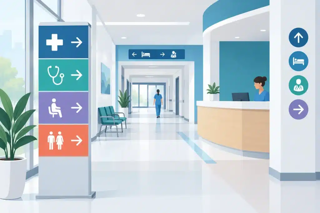
A visitor arrives late for an imaging appointment, parks in an unfamiliar garage, and enters through the wrong lobby. If the route to radiology depends on asking three employees for directions, the facility has a wayfinding problem. Strong healthcare wayfinding signage examples show how a coordinated sign system can reduce stress, protect staff time, and make a large campus easier to use from the first turn into the property.
For hospitals, clinics, medical office buildings, and senior care facilities, wayfinding is more than an interior design detail. It supports patient experience, accessibility, safety, and day-to-day operations. The most effective programs combine exterior directionals, clear building identification, interior directories, room identification, and consistent visual cues that work together.
12 Healthcare Wayfinding Signage Examples
1. Campus entrance monument signs
A monument sign at the main entrance establishes where visitors have arrived before they reach a decision point. On a multi-building medical campus, it can identify the hospital, emergency department, medical offices, outpatient services, and major parking areas. The message should be brief enough to read from a moving vehicle, with high-contrast lettering and arrows that direct traffic without creating hesitation.
These signs need durable construction because they face constant weather exposure, snow removal activity, and vehicle traffic. Illumination may be worth the investment for facilities with early-morning, evening, or emergency access. The right choice depends on site lighting, road speed, and how far from the entrance drivers need to make a turn.
2. Parking lot directional signs
Parking is often the first source of visitor frustration. Directional signs at every lot entrance and major driving intersection can identify patient parking, visitor parking, staff-only areas, accessible spaces, valet, and pickup locations. Use the same names found on appointment instructions and online directions. A visitor should not see “North Lot” in one place and “Lot B” on the property unless both terms are clearly connected.
For larger properties, color-coded zones can make return trips easier. A blue parking zone paired with blue pedestrian signs and blue elevator markers gives visitors a simple visual memory to follow back to their vehicle.
3. Emergency department approach signs
Emergency department signs have a different job than general campus signage. They must be visible quickly, direct vehicles to the correct entrance, and separate emergency traffic from routine patient drop-off when necessary. Large letters, directional arrows, reflective materials, and illuminated cabinet signs are common solutions.
Placement matters as much as fabrication. A sign that is technically visible but appears after a driver has passed the turn is not doing its job. Reviewing the approach from several vehicle paths, including at night, helps identify where signs are needed before the decision point.
4. Main lobby directories
Once inside, visitors need an immediate overview of the building. A lobby directory can list departments, suites, floors, major amenities, and facility maps. In a medical office building, it may identify physician groups by suite number. In a hospital, it may focus on high-traffic destinations such as registration, imaging, lab services, surgery, maternity, and cafeterias.
Printed or digitally changeable directories both have a place. Static directories are clean and dependable when tenants and departments change infrequently. Modular directory systems make more sense where provider groups, clinic names, or room assignments are updated regularly.
5. Elevator and stair identification
Every elevator bank is a reset point. Visitors leaving an elevator need confirmation that they are on the correct floor and clear direction to key departments. Floor identifiers, wall-mounted directional signs, and suite ranges should be visible before someone starts walking down the corridor.
Stair signs deserve the same attention. They support emergency egress, but they also serve staff, visitors, and patients who prefer stairs. Clear level numbers, exit information, and destination indicators improve usability without overloading the sign face.
6. Color-coded department zones
Color can make a large facility feel more manageable. A pediatric wing may use one color family, while oncology, imaging, rehabilitation, and outpatient surgery each use another. The goal is not decoration. Color is a secondary cue that helps people confirm they are following the right route alongside readable text and symbols.
This approach works best when colors are applied consistently across wall directionals, overhead signs, room markers, elevator lobbies, and maps. Color alone should never carry critical information, since some visitors have color-vision limitations and lighting conditions vary.
7. Overhead corridor directional signs
In long hallways or busy intersections, overhead directional signs keep information in the natural line of sight. They are particularly useful where wall space is limited, foot traffic is heavy, or several destinations branch from one point. A well-planned sign may direct visitors toward imaging and lab services in one direction, registration and patient rooms in another, and elevators or exits straight ahead.
These signs must be sized for their mounting height. Small lettering placed high above a corridor creates confusion rather than clarity. Viewing distance, ceiling conditions, sprinkler locations, lighting, and access for installation all need to be considered before fabrication.
8. Wall-mounted directional signs
Wall-mounted directionals are the workhorse of interior wayfinding. They confirm routes at hallway intersections, outside department entries, and near decision points that do not warrant an overhead sign. Their value comes from repetition: the visitor sees the same department name, arrow style, typography, and color treatment throughout the journey.
Modular architectural sign systems are useful when facilities need to update insert panels without replacing the complete sign. That can lower long-term costs for growing clinics, leased medical buildings, and facilities with changing service lines.
9. Department identification signs
A department entry should be unmistakable. Large identification signs for areas such as Cardiology, Physical Therapy, Women’s Health, or Outpatient Surgery give patients the confidence to stop at the right place. These signs can also carry practical details, including check-in instructions, hours, or suite numbers, but the primary department name should remain the clearest element.
In sensitive areas, the design may need a calmer, more welcoming appearance. In high-volume departments, visibility and speed may take priority. The signage system should reflect how each space is used while still maintaining brand consistency.
10. Room, suite, and patient room signs
Room signs help patients, families, clinicians, and support staff move efficiently through the facility. They may identify exam rooms, provider offices, consultation rooms, treatment bays, restrooms, supply spaces, and patient rooms. Tactile lettering and braille are often part of these applications, particularly for permanent room identification.
Healthcare facilities should review applicable accessibility standards and local requirements early in the design process. Mounting height, location beside the door, contrast, tactile character specifications, and pictograms can all affect compliance. Planning this work before wall finishes and furniture are finalized prevents costly field changes.
11. Patient check-in and queue signs
Check-in areas can become confusing when patients must distinguish between registration, insurance verification, lab check-in, and appointment-specific reception desks. Clear counter signs, wall graphics, window lettering, and queue markers organize the process before a staff member needs to intervene.
For privacy-sensitive environments, signage should provide direction without displaying personal information or forcing patients to announce why they are there. Small details, such as a clearly marked “Please check in here” message and an easy-to-see waiting-area label, can reduce bottlenecks during peak hours.
12. Temporary and construction wayfinding signs
Healthcare campuses rarely stay static. Renovations, new service lines, temporary entrances, road work, and department moves can disrupt an otherwise effective system. Temporary directional signs, window graphics, barricade graphics, and portable sign panels help maintain safe routes while permanent work is underway.
Temporary signs should still look intentional. Generic paper notices taped to walls may be fast, but they can be hard to read, inconsistent with the facility brand, and easy to miss. Durable printed panels or changeable sign inserts provide a more dependable option for projects that last weeks or months.
Planning Healthcare Wayfinding Signage That Works
Good wayfinding begins with a route audit, not a sign count. Walk the property as a first-time visitor would: from the public road to parking, from parking to the entrance, from the lobby to a destination, and back out again. Note every place where someone must choose a direction. Those are the locations where identification, confirmation, or directional information may be needed.
Keep language consistent across the system. If appointment reminders say “Imaging Center,” the exterior signs, directory, corridor directionals, and department entry should use that same name. Avoid internal abbreviations that patients will not recognize. “MRI” may be familiar to many visitors, but “DI-2” is not a helpful public-facing destination.
There are trade-offs. A sign system with too much information can overwhelm visitors, while an overly minimal system can leave them without enough reassurance. Digital displays allow quick updates, but fixed signs are often more reliable and easier to read in high-traffic areas. The best solution depends on the size of the property, frequency of changes, budget, and the needs of the people using the space.
For facilities across Northern Colorado and Southern Wyoming, conditions such as snow, intense sun, wind, and frequent temperature swings should also influence material selection and installation methods. A practical signage partner can help coordinate design, fabrication, site conditions, installation, and future updates so the system stays usable after opening day.
When patients and visitors can find their destination without feeling lost, the facility communicates care before the appointment even begins. That is the standard a well-built wayfinding program should meet.


