
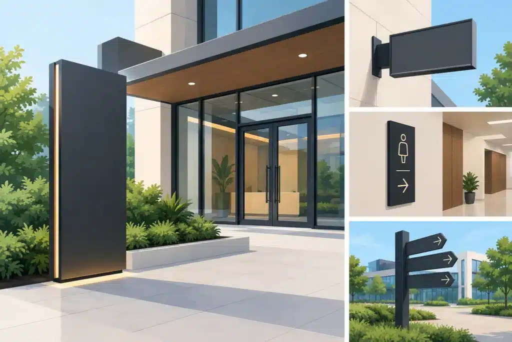
A visitor should not have to stop in a lobby, scan every wall, and ask for directions before finding the right office, restroom, department, or exit. That is where architectural signs come in. So, what are architectural signs? They are permanent or semi-permanent sign systems designed to organize a built environment, support navigation, communicate required information, and carry a brand consistently through a facility.
Unlike a temporary sale banner or one-off promotional display, architectural signage is planned as part of the space itself. It helps a medical office feel orderly, a school feel navigable, a multifamily property feel established, and a corporate office feel aligned with its brand. The best systems work quietly in the background, making the building easier to use for employees, customers, patients, tenants, and visitors.
What Are Architectural Signs Used For?
Architectural signs serve practical needs first. They tell people where they are, where to go next, and what rules or services apply in a particular area. They also create a consistent visual experience from the front door to the back hallway.
In a commercial setting, this can include a lobby directory, suite identification, room numbers, restroom signs, directional signs, stairwell markers, parking guidance, department identification, donor recognition, and wall-mounted brand elements. In larger facilities, the signs often work as a coordinated system rather than as individual pieces.
A healthcare clinic, for example, may need exterior entry identifiers, check-in signage, exam room markers, ADA-compliant restroom signs, directional panels, and staff-only notices. A manufacturing facility may need department signs, safety messaging, aisle markers, office identification, and clear evacuation information. The purpose changes by facility, but the objective remains the same: help people move through the space with confidence.
Architectural Signage vs. Other Commercial Signs
The distinction is not always about where a sign is installed. It is about the sign’s role, expected lifespan, and relationship to the environment.
A storefront sign is designed primarily to attract attention from outside the building. Vehicle graphics turn company vehicles into mobile branding. Banners and window graphics can support short-term promotions. Architectural signs, by contrast, are typically tied to the way a facility functions day after day.
That does not mean architectural signs cannot be visually striking. Dimensional letters in a reception area, branded wall graphics, etched acrylic panels, and illuminated interior features can all make a strong impression. The difference is that they must also fit the building, hold up to routine use, and remain useful long after an initial opening or campaign ends.
For businesses with multiple locations, architectural signage is also a brand-control tool. Standardizing colors, typography, mounting methods, room naming, and directory formats helps every location feel connected while allowing for site-specific needs.
Common Types of Architectural Signs
Most facilities use a mix of sign types. The right combination depends on the size of the property, visitor traffic, code requirements, brand standards, and how often information is likely to change.
Wayfinding and Directional Signs
Wayfinding signs guide people from one decision point to the next. They may direct visitors to a reception desk, building entrance, department, elevator, parking area, restroom, or exit. Effective wayfinding is not simply a matter of adding arrows. It requires understanding how people enter, move through, and interpret the space.
A sign placed too late in a corridor is less helpful than one installed at the intersection where a decision must be made. Clear wording, readable type sizes, contrast, and consistent symbols all matter. In busy facilities, simple and predictable sign placement often works better than overly decorative design.
Identification Signs
Identification signs label a place: a conference room, suite, classroom, exam room, office, break room, or department. These signs reduce confusion and help staff, visitors, and service providers get where they need to go.
Changeable inserts can be useful where room occupants, tenant names, or departments change frequently. Permanent dimensional lettering or routed panels may be a better fit for stable locations where a higher-end appearance is part of the environment.
ADA and Code-Required Signs
ADA signage is a critical part of an architectural sign program. Depending on the application, these signs may require tactile characters, Grade 2 Braille, specific mounting heights, non-glare finishes, and adequate visual contrast. Permanent room identification for restrooms, exits, and other designated spaces is a common example.
Code requirements can vary based on the building type and jurisdiction. A sign system should be designed with those rules in mind from the start, rather than treated as a final detail after walls are finished. This reduces rework and helps protect accessibility for every visitor.
Directories and Tenant Panels
Directories help visitors understand how a property is organized. They are common in medical offices, professional buildings, schools, shopping centers, and multi-tenant commercial properties. A well-designed directory presents information in a logical order and makes updates manageable.
The most attractive directory is not always the most practical one. If tenants turn over regularly, a fixed engraved list can create unnecessary replacement costs. Modular panels, replaceable inserts, or digital elements may make more sense. The right answer depends on the rate of change and the property manager’s maintenance plan.
Branded Interior Features
Architectural signage also includes branded elements that strengthen the character of a space. Reception logos, wall murals, dimensional letters, donor walls, mission statements, privacy graphics, and environmental graphics can all support a cohesive interior.
These elements should do more than fill blank walls. They can define a reception zone, reinforce a company’s values, create visual landmarks for wayfinding, or make a customer-facing space more memorable. Material selection matters here. Acrylic, aluminum, wood, vinyl, laminate, and painted dimensional elements each create a different look, cost profile, and maintenance requirement.
Why Planning Matters Before Fabrication
Architectural sign projects often touch several parts of a building at once. Flooring, wall finishes, lighting, door hardware, paint colors, millwork, and tenant improvements can all affect how signs look and how they are installed.
Planning early gives the project team time to confirm the sign schedule, determine mounting locations, account for electrical needs, select durable materials, and coordinate with contractors. It also prevents a common problem: discovering that a required sign has nowhere appropriate to go after construction is complete.
For a new facility, the sign package should be considered alongside the architectural drawings and interior finish selections. For an existing facility, a site survey helps identify inconsistent signs, missing wayfinding, faded materials, and areas where visitors routinely get lost.
A full-service sign partner can help connect design intent to real-world production. At Action Signs, that means considering not only how a sign will look in a proof, but also how it will be fabricated, installed, maintained, and updated over time.
How to Choose the Right Architectural Sign System
Start with the user journey. Where do visitors park? Which entrance do they use? What is the first decision they need to make? Where are the common points of confusion? These questions reveal where signage will have the most value.
Next, consider the level of permanence. A hospital wing or corporate headquarters may justify custom fabricated signs with premium finishes and long service life. A leased office suite with a changing floor plan may benefit from modular, easy-to-update components. Neither approach is automatically better. The right system balances appearance, durability, flexibility, and budget.
Consistency is another priority. A sign program should establish a repeatable visual language for colors, fonts, icons, panel sizes, and mounting methods. This is especially useful when a business plans to expand, renovate, or open additional locations.
Finally, account for maintenance. Interior signs can be damaged by cleaning, carts, hand traffic, sunlight, or frequent updates. Choosing the least expensive material upfront can create higher costs later if signs need regular replacement. Durable fabrication and thoughtful installation usually pay off in spaces with heavy public use.
A Better Experience Starts With Clear Information
Architectural signs are not just finishing touches for a commercial space. They are working tools that shape how people experience a building, how efficiently staff operate, and how consistently a brand shows up in person.
When visitors can find the right place without asking, when required signs are compliant and readable, and when every panel feels like it belongs in the same environment, the facility works better. That is the standard worth designing for before the walls are finished and the doors open.


