
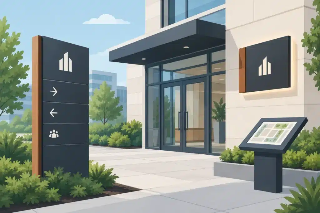
A lobby sign that looks polished but leaves visitors unsure where to check in is not doing its job. The same is true of a suite plaque that cannot be read from the hallway, a restroom sign placed behind an open door, or a wayfinding system that conflicts with the building directory. Architectural signage selection is not simply a matter of choosing attractive materials. It is a practical decision about how people move through your space, how your brand is experienced, and how well the finished system holds up over time.
For offices, healthcare facilities, schools, hospitality properties, retail locations, and multi-tenant buildings, the best results come from planning signage as part of the environment rather than treating it as a final decorative detail.
Start With What the Signage Must Accomplish
Architectural signs generally serve one or more jobs: identifying spaces, guiding visitors, supporting accessibility, reinforcing a brand, communicating rules, or recognizing people and donors. A strong sign program gives each of those jobs the appropriate level of visibility.
Start by walking the customer journey. Consider where a first-time visitor enters, where they pause, what decisions they need to make, and where confusion is likely. In a medical office, that may mean clear check-in, restroom, and exam-room identification. In a corporate campus, it may involve exterior directional signs, building directories, reception branding, and room identification across multiple floors.
This exercise also reveals when one sign is trying to do too much. A lobby directory should not be expected to function as a tenant identity sign from the parking lot. Likewise, a branded wall logo may create a strong first impression, but it does not replace directional information. Separate functions usually produce a cleaner, easier-to-use environment.
Think Beyond the Opening Day
A sign package should support daily operations after the ribbon cutting. Ask which information is likely to change. Tenant names, room assignments, office hours, employee titles, and safety notices may need regular updates. Those are good candidates for modular systems with replaceable inserts, changeable panels, or digital components where appropriate.
Permanent information deserves more permanent construction. Building identification, restrooms, exits, stairwells, and core departmental markers should be designed for long service life. Selecting a material solely because it has a lower initial cost can create repeat replacement work later.
Architectural Signage Selection Starts With the Environment
The location determines much of the right answer. Indoor signs are not exposed to the same UV, moisture, temperature swings, and cleaning requirements as exterior signs. Even within a building, a quiet executive suite has different needs than a school hallway, industrial facility, or busy healthcare corridor.
Acrylic, dimensional letters, aluminum, routed PVC, wood, vinyl graphics, printed panels, and engraved substrates can all be effective. The right material depends on appearance, budget, expected wear, cleaning practices, and installation surface.
For example, dimensional acrylic or metal letters can create a refined lobby presence and add useful visual depth. They work well when brand perception is a priority, but they require accurate wall preparation and secure installation. Printed wall graphics can deliver large-scale color and visual impact at a more accessible cost, though they may be less suitable for high-contact surfaces or walls that will be repainted often.
In high-traffic settings, durability matters as much as appearance. Schools, hospitals, public buildings, and manufacturing facilities often benefit from materials and finishes that resist scratches, clean easily, and maintain legibility under regular use. A finish that looks excellent in a sample may not be the right choice near carts, cleaning equipment, or heavy foot traffic.
Lighting, Viewing Distance, and Contrast Matter
A sign can be technically correct and still fail if people cannot see or read it. Viewing distance should guide letter size, layout, and mounting height. A room identification sign can use smaller copy than a corridor directional sign, while exterior building identification must be readable from much farther away.
Lighting changes the equation. Consider natural light, shadows, glare from glass, overhead fixtures, and nighttime conditions. Low-contrast colors may fit a brand palette but become hard to read under certain lighting. In many cases, a high-contrast sign face with brand color used as an accent delivers a stronger result than placing colored copy on a similarly toned background.
Type selection deserves the same practical approach. Decorative fonts may work for a logo, but wayfinding information needs straightforward letterforms, clear spacing, and hierarchy. Visitors should be able to scan a sign quickly without stopping to interpret it.
Plan for Accessibility From the Beginning
Accessibility should be integrated into the sign plan, not added after fabrication. ADA-compliant identification signs may require specific tactile characters, Braille, contrast, non-glare finishes, mounting locations, and dimensions. These requirements commonly apply to permanent rooms and spaces, including restrooms, exits, stairwells, and designated offices.
Directional signs and temporary messages may follow different requirements, so the details depend on the sign’s use. That is why it helps to identify signs by function early in the planning process. A knowledgeable signage partner can help distinguish which signs need tactile elements and which need clear visual communication without the same construction requirements.
Placement is just as critical as fabrication. A compliant sign mounted in the wrong location may still be difficult to find or use. Door swings, wall obstructions, corridor traffic, and approach paths all need to be considered before installation.
Build a System, Not a Collection of Signs
Consistency is what makes architectural signage feel intentional. It does not mean every sign needs the same size or layout. It means visitors can recognize a pattern: the same colors, typography, pictograms, mounting approach, and information hierarchy across the property.
A system also makes future growth easier. When a business adds departments, reconfigures offices, or opens another location, established standards reduce decision time and help protect brand consistency. This is particularly valuable for franchise operators, property managers, healthcare groups, and organizations with multiple facilities.
Develop a sign family that accounts for the full range of needs, including exterior identification, directories, directional signs, room IDs, regulatory signs, wall graphics, and branded feature elements. Not every project requires every category, but considering the complete system prevents visible gaps later.
There is a budget benefit as well. Standardizing common sign types can improve production efficiency and simplify replacements. At the same time, a system should leave room for focal points. Your main lobby logo, donor wall, or customer-facing feature wall may warrant more custom fabrication than routine room markers.
Coordinate Design, Fabrication, and Installation
The most common signage problems often begin before anything is made. Dimensions may be based on an outdated floor plan. A wall may not support the planned mounting method. Electrical access for illuminated elements may be missing. A landlord, property manager, or local authority may require approvals that affect placement or design.
Good project coordination addresses those conditions early. Field verification confirms wall conditions, measurements, sightlines, and installation access. It also gives the fabrication team a chance to recommend practical adjustments before materials are ordered.
For larger projects, phased installation can keep operations moving. A medical office may need signs installed after hours. A school may need work completed during a break. A construction project may require temporary jobsite and safety signage before permanent architectural signs are ready. The schedule should match the way the property operates.
Working with one accountable partner for design, fabrication, installation, and future service reduces handoffs between separate vendors. At Action Signs, in-house production and field installation experience help keep design decisions tied to the realities of materials, timing, and site conditions.
Make the Budget Decisions That Have the Most Impact
Architectural sign budgets vary widely because scope and materials vary widely. The best approach is not to make every sign less expensive. It is to invest where visibility, durability, and brand impact matter most, then use efficient standardized solutions where appropriate.
Prioritize the signs that affect first impressions and navigation. Exterior building identification, primary entry signs, lobby branding, and major wayfinding points are often high-value investments because they influence how people find and evaluate the business. Room IDs, back-of-house notices, and changeable information can often use more economical formats without compromising the overall system.
Be clear about what is included in the project: site survey, design development, permits when needed, fabrication, hardware, installation, and future replacement components. A lower quote can become more expensive if it excludes necessary steps or uses materials that do not fit the environment.
Before approving a final design, stand in the space and ask a simple question: can a first-time visitor understand where to go without asking for help? When the answer is yes, the signage is doing more than decorating the building. It is making the business easier to use, easier to trust, and ready to support the people who walk through the door every day.


